


There is a reason the Soft Autumn Color Palette feels instantly calming, flattering, and easy to wear. It sits in that sweet spot between warmth and softness, which means the colors never look loud, icy, or overly sharp. Instead, they create a gentle, blended effect that works beautifully on people whose natural coloring has low contrast and a warm undertone.
- What Is the Soft Autumn Color Palette?
- How to Tell if Soft Autumn Colors Suit You
- Why the Soft Autumn Color Palette Looks So Good
- The Best Shades in the Soft Autumn Color Palette
- Colors to Avoid in a Soft Autumn Wardrobe
- How to Build Outfits with the Soft Autumn Color Palette
- Soft Autumn Makeup That Looks Natural
- Soft Autumn Hair Color Ideas
- Common Mistakes People Make with the Soft Autumn Color Palette
- Can You Wear Trends and Still Stay Soft Autumn?
- FAQ About the Soft Autumn Color Palette
- Conclusion
If bright colors make you look tired, if stark black feels too harsh, or if pure white seems to sit on top of your features instead of blending with them, the Soft Autumn Color Palette may be exactly where your best shades live. In seasonal color analysis, Autumn palettes are generally warm, and the softer branch of Autumn leans muted rather than bold. Seasonal color analysis itself is built around finding colors that harmonize with a person’s natural coloring, especially skin, hair, and eye contrast, and the broader method has become popular again in recent years.
What makes this palette so wearable is that it does not ask you to dress in head to toe brown or commit to obvious “fall colors” every day. The Soft Autumn Color Palette is more refined than that. Think moss instead of neon green, dusty peach instead of hot coral, warm taupe instead of crisp white, and softened teal instead of electric blue. These shades feel polished, grounded, and approachable, which is exactly why they are so practical in a real wardrobe.
What Is the Soft Autumn Color Palette?
The Soft Autumn Color Palette is a warm, muted, and low contrast seasonal palette. In simple terms, that means the colors carry a golden or earthy warmth, but they are toned down rather than vivid. Muted colors are low in saturation, so they look softer and less intense than bright shades. Adobe describes muted colors as subdued, desaturated, and softer than vivid tones, which is a useful way to understand why Soft Autumn shades feel so gentle on the eye.
This is also why the Soft Autumn Color Palette feels so wearable in everyday life. The colors do not fight for attention. They blend. They flatter. They make your features look more balanced because the palette mirrors the same softness and warmth that already exists in your natural coloring.
In many seasonal systems, Soft Autumn sits close to Soft Summer because both are muted. The difference is temperature. Soft Summer drifts cooler and more gray. Soft Autumn stays warmer, earthier, and slightly richer. That warmth matters. It is what makes olive, camel, muted rust, warm beige, sage, and soft turquoise feel at home in the Soft Colors.
How to Tell if Soft Autumn Colors Suit You
The easiest clue is your overall contrast level. If your features look blended rather than sharply defined, the Soft Autumn Color Palette is worth considering. Your hair, skin, and eyes may not look dramatically different from each other. Nothing looks extremely dark, extremely bright, or extremely icy.
People who suit the Soft Autumn Color Palette often have one or more of these traits:
- Warm or neutral warm skin that may read golden, peachy, or softly olive
- Hair that looks medium brown, dark blonde, warm ash brown, golden brown, or softly auburn
- Eyes that seem muted rather than piercing, such as soft hazel, gray green, warm brown, olive green, or softened blue green
- A better response to cream, taupe, camel, moss, and dusty rose than to black, optic white, or jewel tones
Seasonal color analysis generally sorts people using warmth versus coolness and the level of contrast in their coloring. In that framework, Autumn belongs to the warm side of the spectrum, while muted palettes rely on lower saturation and gentler contrast.
A very practical test is this: put on a stark black top and then switch to a warm taupe, olive, or soft espresso. If the softer warm shade makes your skin look calmer and your eyes look clearer, that is a strong clue that the Soft Autumn Color Palette may work better for you.
Why the Soft Autumn Color Palette Looks So Good
The answer comes down to harmony. Good color styling is not really about chasing the trendiest shade in the shop. It is about choosing tones that echo the qualities already present in your appearance. Color harmony focuses on combinations that feel balanced and visually pleasing, and it considers factors like temperature, value, and saturation.
That is exactly why the Soft Autumn Color Palette is so effective. The palette does not overpower the face. It supports it. Muted colors are also widely associated with calm, warmth, familiarity, and sophistication, which helps explain why Soft Autumn outfits often look polished without looking try hard. Adobe notes that muted colors can create a serene atmosphere and promote harmony and balance, which describes the effect of this palette very well.
There is also a practical benefit. Seasonal color analysis has long been promoted as a way to coordinate wardrobes more easily and avoid purchases that do not fit your best palette. Even though the method is not an exact science, that logic is part of why so many people find it useful. When you stay within a cohesive range, it becomes much easier to mix pieces, choose makeup, and build outfits that feel intentional.
The Best Shades in the Soft Autumn Color Palette
The Soft Autumn Color Palette shines when you choose colors that are warm, dusty, and gently faded rather than crisp or high contrast. These are the shades that usually work best.
Neutrals
Your neutrals are the backbone of the Soft Autumn Color Palette, and they are often the reason this season builds such an elegant wardrobe.
- Warm beige
- Oatmeal
- Camel
- Mushroom
- Taupe
- Soft olive brown
- Cocoa
- Soft espresso
- Warm navy
- Cream, not bright white
These neutrals are more forgiving than pure black and more flattering than stark white. Pantone has also noted that neutral tones have become increasingly important in trend forecasting, which helps explain why this palette feels both timeless and current.
Greens and Blues
This is where the Soft Autumn Color Palette becomes especially beautiful. Instead of icy or neon versions, you want softened, earthy tones.
- Sage
- Moss
- Olive
- Eucalyptus
- Muted teal
- Dusty turquoise
- Petrol blue
- Warm slate blue
These shades bring color into your wardrobe without breaking the soft, warm mood that makes the Soft Autumn Color Palette so flattering.
Reds, Oranges, and Pinks
Warmth matters here, but brightness should stay controlled.
- Terracotta
- Cinnamon
- Dusty coral
- Salmon
- Peach
- Apricot
- Warm rose
- Brick
- Muted rust
These shades are especially useful for knitwear, lipstick, scarves, and printed tops.
Yellows
Bright yellow can be difficult on a Soft Autumn. Softer versions usually work much better.
- Mustard
- Honey
- Antique gold
- Soft marigold
Used well, these colors can make the Soft Autumn Color Palette feel rich without becoming too bold.
Colors to Avoid in a Soft Autumn Wardrobe
Knowing what not to wear is often just as useful as knowing what to buy. The Soft Autumn Color Palette usually struggles with colors that are too bright, too cool, or too stark.
The biggest problem shades are often:
- Pure black
- Pure white
- Icy pastels
- Blue based pinks
- Neon tones
- Highly saturated jewel tones
- Very cool grays
- Sharp blue reds
These colors tend to compete with the softness of the Soft Autumn Color Palette. They can make the complexion look tired, emphasize shadows, or overwhelm delicate features.
That does not mean you can never wear them. It just means they usually work better away from the face. A black shoe or bag is easier to handle than a black turtleneck. A crisp white skirt may be manageable if you pair it with a warm beige top. Styling always gives you room to adapt.
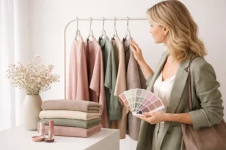
How to Build Outfits with the Soft Autumn Color Palette
One reason the Soft Autumn Color Palette works so well is that the colors already harmonize with each other. You do not need to force complicated combinations.
A simple way to dress in this palette is to use a soft neutral base, then add one earthy accent and one deeper anchor shade. For example, cream trousers, a sage knit, and a soft cocoa bag create an outfit that feels complete without feeling busy.
Another easy formula is tonal dressing. Build an outfit around neighboring shades, like oatmeal, camel, and warm brown. Because the Soft Autumn Color Palette is muted, tonal outfits look especially expensive and effortless.
Here are a few combinations that work beautifully:
| Outfit Mood | Best Combination |
|---|---|
| Casual everyday | Oatmeal + olive + soft denim |
| Office ready | Mushroom + teal + cocoa |
| Weekend relaxed | Camel + sage + cream |
| Date night | Dusty rose + warm navy + bronze |
| Autumn inspired | Terracotta + moss + taupe |
Pantone’s recent fashion reporting has described autumn and neutral color stories using phrases like understated ease and nuanced, pleasing shifts in hue, which is very much the feeling you want from the Soft Autumn Color Palette.
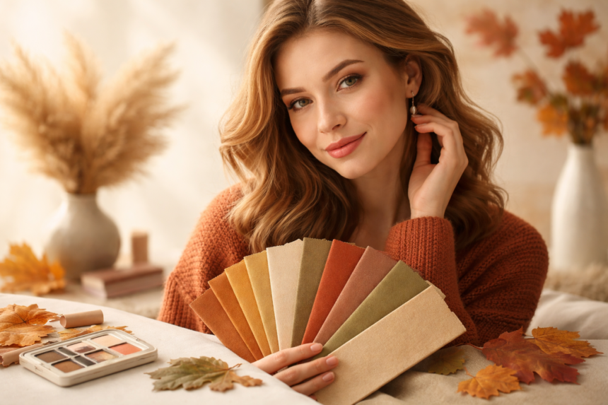
Soft Autumn Makeup That Looks Natural
The Soft Autumn Color Palette is not only for clothes. It often makes makeup choices easier too.
Base products usually look best when they lean neutral warm rather than pink or very golden orange. Blush tends to work beautifully in apricot, warm rose, peach, and muted terracotta. Eyeshadow often looks best in olive, bronze, taupe, soft cocoa, muted plum brown, and antique gold.
Lip colors are where many Soft Autumn people notice the biggest difference. Instead of cool mauves or bright reds, the most flattering lip colors are often:
- Peachy nude
- Warm rose
- Cinnamon pink
- Soft terracotta
- Burnt coral
- Caramel brown nude
The goal is not heavy contrast. It is balance. The best Soft Autumn makeup makes you look more alive, not more painted.
Soft Autumn Hair Color Ideas
Hair color can either strengthen the Soft Autumn Color Palette or work against it. The most flattering tones usually stay warm, soft, and blended.
Good options often include chestnut brown, soft golden brown, beige brunette, muted copper brown, caramel ribbons, or warm dark blonde. Very ashy colors can drain warmth from the face, while blue black can feel too harsh against a low contrast appearance.
If you color your hair, think softness first. The Soft Autumn Color Palette tends to look best with dimension, not extreme contrast. Blended highlights, subtle warmth, and natural looking depth usually work better than dramatic cool tones.
Common Mistakes People Make with the Soft Autumn Color Palette
The first mistake is assuming warm automatically means bright. It does not. The Soft Autumn Color Palette is warm, yes, but it is also muted. Bright orange, clear tomato red, and electric turquoise are usually too sharp.
The second mistake is relying on black for sophistication. In reality, many people in the Soft Autumn Color Palette look far more elegant in deep olive, espresso, warm navy, or rich brown.
The third mistake is buying isolated trendy pieces without checking whether they belong to the palette. This is where color harmony becomes useful in real life. A smaller, cohesive palette often creates more outfit possibilities than a closet full of random statement pieces. Color harmony guidance also stresses keeping a palette simple and using contrast intentionally rather than excessively.
Can You Wear Trends and Still Stay Soft Autumn?
Absolutely. The Soft Autumn Color Palette is actually quite trend friendly because fashion regularly returns to earthy neutrals, softened greens, warm browns, and understated color stories.
The trick is filtering trends through your palette. If cherry red is trending, choose brick or muted rust. If icy blue is everywhere, reach for dusty teal. If bright pink dominates stores, go for salmon or warm rose instead.
This approach helps you look current without losing what flatters you. It also saves money because your wardrobe stays coherent over time, which is one of the long standing appeals of seasonal color analysis.
FAQ About the Soft Autumn Color Palette
Is the Soft Autumn Color Palette warm or neutral?
The Soft Autumn Color Palette is primarily warm, though some people within it can appear neutral warm rather than obviously golden.
Can Soft Autumn wear black?
Usually not near the face in its pure form. Softer alternatives like espresso, olive brown, or warm navy are often better.
Is Soft Autumn the same as True Autumn?
No. True Autumn is usually warmer and richer. The Soft Autumn Color Palette is gentler, dustier, and less intense.
Can Soft Autumn wear silver?
Aged silver, pewter, or mixed metals can work, but many people in the Soft Autumn Color Palette look better in bronze, antique gold, or softer metallics than in bright chrome silver.
Conclusion
The real strength of the Soft Autumn Color Palette is that it makes style feel easier. Once you understand that your best colors are warm, muted, and softly blended, shopping becomes simpler, outfits come together faster, and your wardrobe starts to feel more like you. Instead of chasing harsh contrast or overly bright trends, you lean into shades that make your features look calm, balanced, and naturally polished.
That is why the Soft Autumn Color Palette continues to resonate with so many people. It offers softness without looking washed out, warmth without looking loud, and elegance without needing effort. If you have ever felt your best in moss, taupe, camel, dusty peach, or muted teal, there is a good chance this palette is already speaking your language. And if you want to understand the broader idea behind seasons and undertones, the concept of seasonal color analysis gives helpful background.


