


The Soft Summer Color Palette has a quiet kind of beauty that feels polished without trying too hard. It is not flashy, overly bright, or sharp. Instead, it leans into cool, muted, and gently blended shades that make an outfit look refined, calm, and naturally put together. If bold colors often feel too loud on you, or if dusty blues, smoky roses, and soft grays seem to make your features look more balanced, this palette may be exactly where your style feels most at home.
- What is the Soft Summer Color Palette?
- Why muted tones look so elegant
- Signature colors in the Soft Summer Color Palette
- Colors Soft Summer should usually avoid
- How to build outfits with muted tones
- Smart outfit ideas for Soft Summer wardrobes
- Best neutrals for Soft Summer
- Accessories, metals, and prints that work best
- How to tell if Soft Summer colors suit you
- Common mistakes people make with the Soft Summer Color Palette
- Why Soft Summer works so well for capsule wardrobes
- Final thoughts on styling muted tones with confidence
- FAQ
What makes this palette so appealing is its wearability. The colors are elegant enough for work, easy enough for everyday outfits, and soft enough to create a wardrobe that mixes well without much effort. In seasonal color analysis, Soft Summer sits in the Summer family and is defined by coolness and softness, with colors that are muted rather than crisp or saturated.
That means the goal is not to wear the palest shades possible or to build an entire closet around boring neutrals. The real strength of the Soft Summer Color Palette is subtle contrast. It works beautifully when cool undertones meet low saturation, creating outfits that feel smooth, cohesive, and sophisticated instead of harsh.
What is the Soft Summer Color Palette?
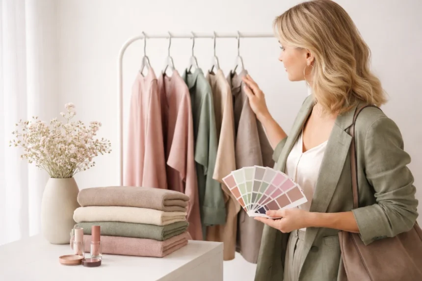
The Soft Summer Color Palette is made up of colors that are cool, muted, and medium in overall intensity. Think dusty blue, soft mauve, heather gray, misty teal, rose brown, smoky plum, and gentle taupe. These colors are softened with gray, which is why they feel blended and understated rather than bright or dramatic.
In seasonal color analysis, Soft Summer is often described as flowing between True Summer and Soft Autumn. That is why the palette can sometimes include a touch of earthy softness, but it still stays on the cool side overall. If a color looks frosty, icy, neon, or highly warm, it usually steps outside the most flattering range.
This palette tends to suit people whose natural coloring looks blended rather than high contrast. Hair, eyes, and skin usually do not create a dramatic difference from one another. The effect is softer, gentler, and more low-contrast, which is exactly why muted tones tend to harmonize so well.
Why muted tones look so elegant
Muted tones have a reputation for being safe, but that is not the same thing as boring. In fashion and color theory, muted colors work because they reduce visual noise. Adobe describes muted colors as shades toned down with gray, which makes them feel calmer, more nuanced, and easier to pair. That is a big reason they translate so well into clothing and capsule wardrobes.
When you wear highly saturated colors, the outfit often becomes the loudest thing in the room. That can be fun, but it can also overpower softer features. Muted tones behave differently. They let the person stand out first while the clothing supports the overall look. That is one of the biggest reasons the Soft Summer Color Palette often feels effortlessly chic.
There is also a practical advantage. Soft, cool, dusty shades usually mix more easily than bright colors, which means fewer wardrobe mistakes and more outfit combinations that just work on the first try.
Signature colors in the Soft Summer Color Palette
If you are trying to recognize this palette quickly, focus on shades that look softened, cool, and slightly gray-toned.
Some of the most recognizable colors include:
- dusty rose
- muted mauve
- soft raspberry
- smoky navy
- blue-gray
- sage with a cool cast
- muted teal
- lavender gray
- mushroom taupe
- cool beige
- charcoal
- soft white
These shades work because they stay low in chroma, meaning they are not highly saturated or overly vivid. Soft Summer colors are usually more flattering when they feel blended and slightly misty rather than clean and punchy.
Colors Soft Summer should usually avoid
Knowing what not to wear can be just as helpful as knowing what to buy. The shades that tend to fight against a Soft Summer look are the ones that are too bright, too warm, or too stark.
That often includes:
- neon shades
- bright orange
- tomato red
- sunny yellow
- sharp black
- pure white
- vivid lime
- electric blue
These colors can overwhelm the palette’s softness and create a disconnect between your clothing and your natural coloring. The result is often that the outfit appears louder, while the face looks more faded or tired by comparison. Seasonal color analysis sources consistently note that Soft Summer benefits from muted coolness, not intense warmth or high contrast.
How to build outfits with muted tones
Styling muted colors gets much easier once you stop treating them as plain neutrals. The smartest way to wear them is to create softness through layering, texture, and low-contrast combinations.
Start with a soft neutral base
Choose one of these as your foundation:
- soft navy
- mushroom taupe
- cool gray
- muted stone
- dusty charcoal
A base color like this gives structure to your wardrobe and makes it easier to add softer accents without clashing. In practical terms, this could mean gray tailored trousers, a muted navy knit, or a taupe trench coat.
Add one to two muted accent colors
Once the neutral base is in place, bring in colors like mauve, dusty blue, rose brown, or smoky teal. These shades add personality without creating the sharp contrast that Soft Summer wardrobes tend to avoid. The beauty here is balance. The outfit still has color, but it feels seamless rather than loud.
Use texture to keep outfits interesting
Muted tones rely heavily on fabric texture. Since the colors are soft, texture adds depth. Think brushed knits, suede accessories, silk blouses, fine wool, washed denim, and matte leather. These materials make quiet colors feel intentional and luxurious. This matters because styling is not just about hue. It is also about how color interacts with surface and light.
Smart outfit ideas for Soft Summer wardrobes
A big reason people love the Soft Summer Color Palette is that it suits real life. It works for office outfits, casual days, travel wardrobes, and dressier looks without demanding a complete reinvention of your closet.
Everyday casual look
Pair a heather gray T-shirt with soft blue jeans and muted rose sneakers. Add a dusty mauve cardigan or a cool taupe crossbody bag for a polished finish. The result feels relaxed, flattering, and easy to repeat.
Workwear look
Try charcoal trousers, a smoky blue blouse, and a soft gray blazer. Instead of bright white, use a gentle off-white or cool ivory if you want a lighter piece near the face. This keeps the outfit professional without creating harsh contrast.
Evening look
A muted plum dress, silver jewelry, and soft navy heels can look incredibly elegant. The effect is refined and modern because the palette does not rely on harsh black for sophistication.
Travel wardrobe look
Travel outfits benefit from colors that mix easily. A Soft Summer capsule built around gray-blue, taupe, mauve, and charcoal makes packing easier because almost everything coordinates. This is where muted tones really prove their value.
Best neutrals for Soft Summer
Many people assume black and bright white are wardrobe essentials for everyone. They are not. For Soft Summer, gentler neutrals usually look far better.
The best neutrals often include:
- soft white
- dove gray
- cool taupe
- mushroom
- rose beige
- blue-gray
- soft navy
- muted charcoal
These shades are useful because they anchor the wardrobe while still respecting the palette’s softness. Instead of creating a severe frame around the face, they blend more naturally and allow softer colors to shine.
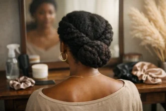
Accessories, metals, and prints that work best
Accessories can make or break this palette. If your outfit is beautifully muted but your bag is neon coral or your jewelry is bright yellow gold, the harmony can disappear quickly.
Soft Summer usually works well with:
- silver
- pewter
- soft rose metal
- cool pearls
- brushed finishes rather than high-shine finishes
For prints, look for watercolor florals, blurred stripes, soft plaid, or low-contrast patterns. High-contrast black-and-white prints can feel too sharp, while muted mixed-color patterns usually blend more naturally into the wardrobe. The Concept Wardrobe’s Soft Summer resources also point toward understated, subtle makeup and coordinated accessories rather than bold, stark contrast.
How to tell if Soft Summer colors suit you
You do not need professional draping to notice the difference. Often, your best colors make your skin look calmer and more even, while your eyes appear clearer and your features look more balanced.
A few signs that Soft Summer shades may suit you:
- bright colors seem to wear you instead of you wearing them
- pure black looks too heavy
- very warm tones make your skin appear dull
- dusty pink, cool gray, and smoky blue look natural near your face
- low-contrast outfits tend to feel more flattering than bold color blocking
Undertone also matters here. MasterClass notes that undertones can influence which colors look most natural on you, which helps explain why cool and muted shades feel more harmonious for some people than bright warm ones.
Common mistakes people make with the Soft Summer Color Palette
One of the biggest mistakes is assuming soft means pale. It does not. Soft Summer can wear medium-depth shades beautifully as long as they stay cool and muted. Smoky navy, dusky plum, and charcoal can be far more flattering than washed-out pastels.
Another mistake is wearing only gray. Gray can be beautiful in this palette, but it is not the whole story. Soft Summer comes alive when you mix muted cool shades together, such as rose with taupe or blue-gray with plum.
A third common issue is adding too much contrast. A soft outfit paired with stark black boots or a bright handbag can disrupt the entire balance. The palette works best when the overall impression stays blended and gentle.
Why Soft Summer works so well for capsule wardrobes
Capsule wardrobes depend on versatility, and muted tones are naturally versatile. Adobe’s overview of muted colors highlights their calm, balanced quality, which is exactly why they are so easy to combine across categories like fashion and design. When your colors already share a softened quality, mixing tops, trousers, skirts, layers, and accessories becomes far easier.
That means fewer impulse buys, fewer pieces that sit unworn, and more outfits that feel cohesive. A Soft Summer Color Palette wardrobe often feels expensive even when it is built slowly, because the colors coordinate in a way that looks thoughtful and consistent.
Final thoughts on styling muted tones with confidence
The real charm of the Soft Summer Color Palette is that it proves subtle does not mean forgettable. These colors are graceful, wearable, and quietly beautiful. They make style feel less stressful because they work together so naturally, and they help create outfits that look polished without leaning on harsh contrast or trend-driven brightness.
When you understand how to style muted tones, getting dressed becomes easier. You stop chasing colors that look exciting on a hanger but feel wrong once they are on. Instead, you build around shades that flatter your features, support your wardrobe, and create a calm sense of elegance that lasts beyond one season. That is why this palette continues to resonate with people who love timeless style and soft seasonal colors.
FAQ
What colors are in a Soft Summer wardrobe?
Soft Summer wardrobes usually include cool, muted shades such as dusty blue, mauve, smoky plum, blue-gray, taupe, soft navy, and cool rose.
Can Soft Summer wear black?
Soft Summer can wear softened charcoal or smoky navy more easily than true black. Pure black often looks too strong against the palette’s natural softness.
Is Soft Summer warm or cool?
Soft Summer is generally cool, though it may have a slightly neutral quality compared with cooler Summer subtypes. Its defining features are softness and coolness.
What metals look best on Soft Summer?
Silver, pewter, soft rose tones, and other cool-toned metals usually work best because they echo the palette’s understated cool quality.


